UX/UI RESEARCH & DESIGN
Empowering trans youth through an improved digital experience
Context
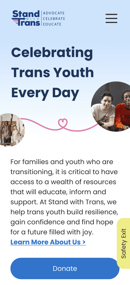
Our year-long capstone course matched teams of students to local organizations to help them reimagine a digital product, and our team was matched with Stand with Trans. Stand with Trans is a Michigan-based nonprofit organization that provides critical support to trans youth and their loved ones. When executive orders targeting trans youth were signed in January 2025, Stand with Trans' website traffic increased by 150%; however, significant accessibility and organizational issues on the current website make it difficult for users to find key resources.
How might we…
streamline the mobile experience for accessing critical resources while prioritizing accessibility for all users?
Preliminary Research
Questions to Explore
What aspects of the current website do users value, and why?
How can users of the website best have their diverse and growing needs met?
What aspects of the current website make it difficult for users to access critical information, and why?
What challenges do users face in navigating the current website, and what causes these challenges?
Methods
Accessibility Audit
Conducted automated and manual testing of the website to identify areas that could be barriers to accessibility.
User Interviews
Listened to users discuss their experiences related to being trans, being an ally, navigating resources, and feeling affirmed in digital spaces.
Usability Testing
Directed users to complete various tasks on the current Stand with Trans website and provide feedback.
Identified Needs
Users need a website that adapts to their changing circumstances while providing a friendly, welcoming, community-driven space.
Users struggle to navigate the current website due to too many options, unclear pathways, excessive steps, and mismatched expectations of the navigation bar.
The current website’s disorganized content structure and unclear labels make it difficult for users to find key resources.
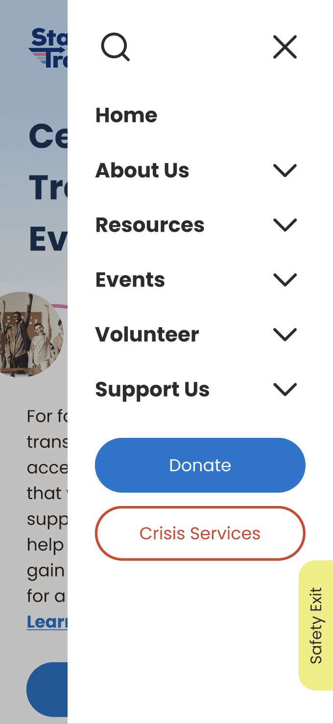
Widespread accessibility issues across the website hinder usability for users. This is especially true of the website’s mobile version.
Ideation
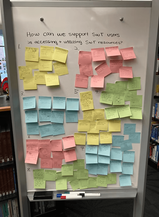
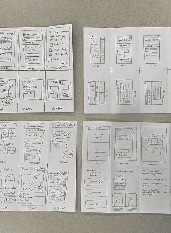
As a team, we started with a brainstorming session where we wrote or sketched ideas for how to address each design requirement (left image).
We expanded on these thoughts in a sketching exercise in which the team had 8 minutes to sketch 8 different ideas (right image).
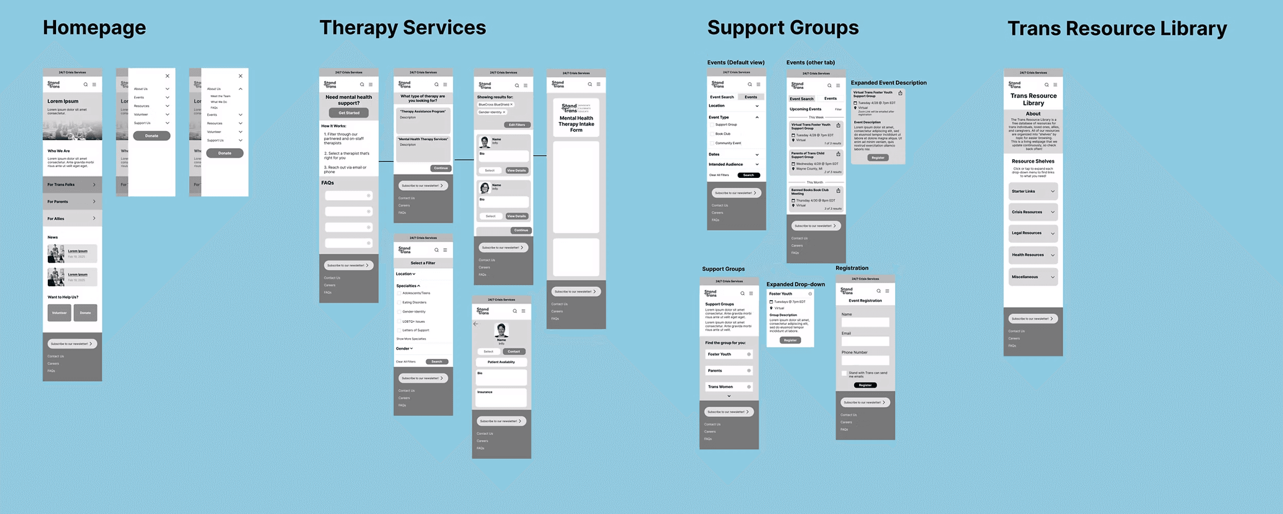
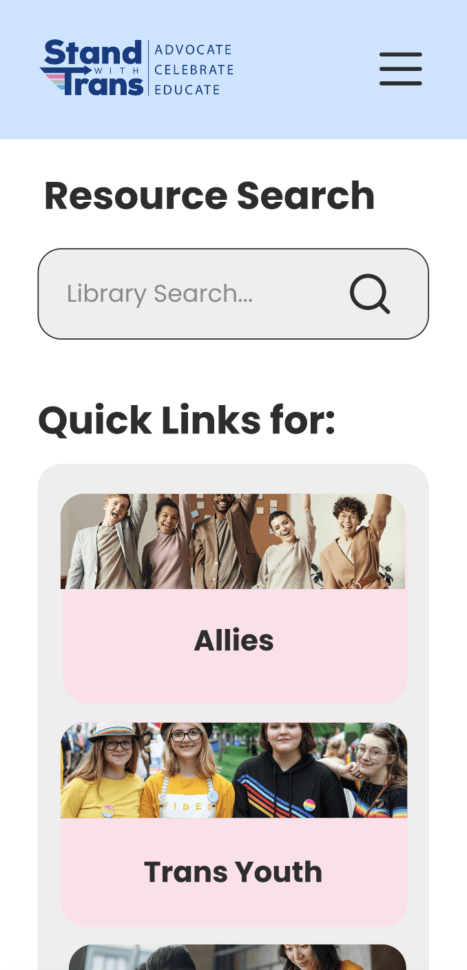
Wireframes
With our brainstormed ideas in mind, we set out to create low-fidelity screens for four distinct sections of the website: Homepage. Therapy Services, Events/Support Groups, and the Trans Lifeline Library.
Iterative Feedback & Key Revisions
To ensure our designs were intuitive for users, we tested our designs—through low, mid, and high fidelity—with 36 potential users. We also gained expert feedback from our instructors and the Stand with Trans client.
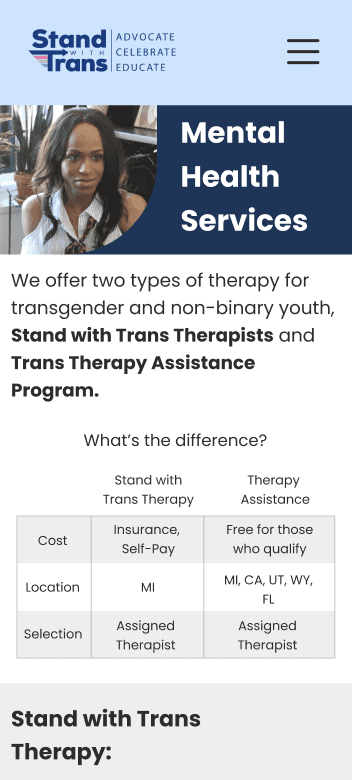
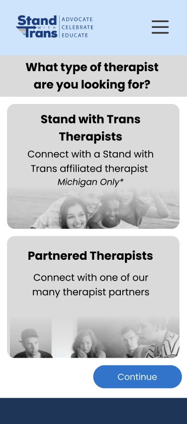
Distinguishing Between Therapy Services
Client clarification informed us that the “Stand with Trans Therapists” type (previously known as “Mental Health Therapy”) is only available in Michigan. In addition, we learned that the two types of therapists use different matching systems, so it's unfeasible to combine them.
In order to ensure users can still tell the difference between the services, we added a chart to the landing page of therapy services to compare the two programs.
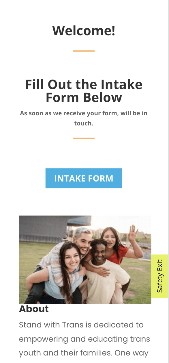
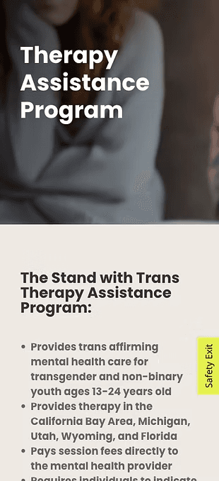
Mid-Fidelity
High-Fidelity
Simplifying the Events Calendar
While the initial design decision to create tabs within the events calendar was to create a distinction between the calendar and the new filtering system, users did not understand the purpose of the tabs. We removed these tabs and placed the filtering tool in a slide-in overlay.
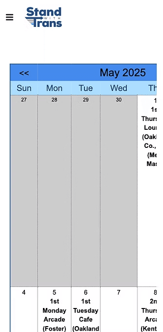

low-Fidelity
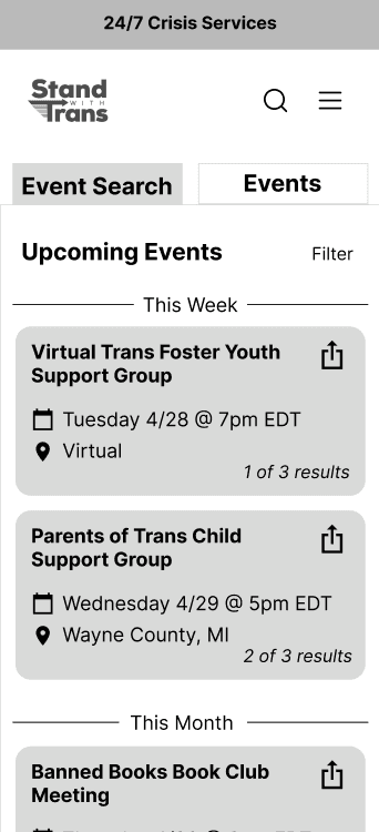
High-Fidelity
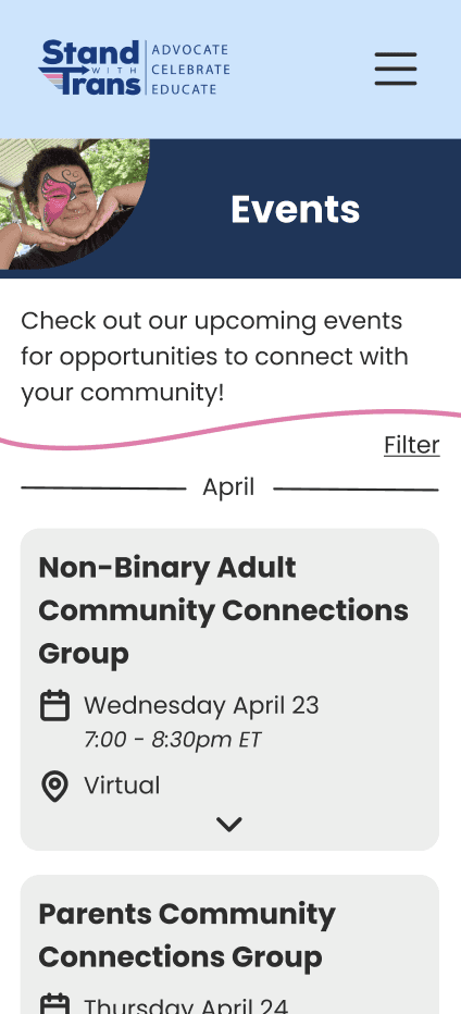
Final Designs
User Testing
In the last few weeks of this project, our team conducted 14 moderated usability tests with current and potential users. Half of the users tested the current site, and the other half tested our prototype. We measured four metrics* during each session: success rate, number of clicks, Single Ease Question SEQ), and the System Usability Scale (SUS).
*Success rate was measured on a scale from 0 to 2: 0 = failed to complete task, 1 = succeeded with some challenges, 2 = succeeded with minimal or no challenges. Single Ease Question (SEQ) asked the user after each task "Overall, on a scale of 1-7 (1 = very difficult, 7 = very easy), how difficult or easy was that task?" The System Usability Scale (SUS) was measured through a 10-question (5-point scale) survey for the participant to assess the usability of the interface after all the tasks.
Testing Results
68% decrease in number of clicks to register for a support group on the prototype compared to the website.
2.6x higher success rate to locate upcoming events on the prototype compared to the website.
The average SUS score increased from 56.43/100 to 92.14/100, indicating higher usability on the prototype.
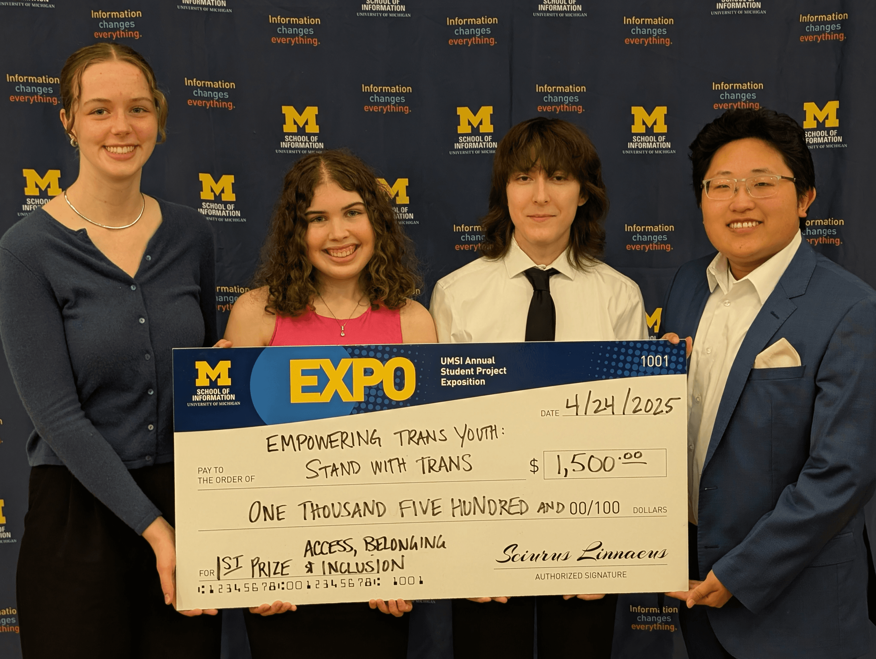
Project Outcomes
Our project received first prize for the "Access, Belonging, and Inclusion" award at the annual UMSI Student Exposition. This award recognizes projects focusing on broadening access, reducing obstacles to information and resources., and enabling fair treatment and full participation of all people. We are deeply honored and grateful that our work with Stand with Trans was recognized for its impact on the trans community.