design system
Streamlining Iron Mountain Express' design process
TEAM
ROLE
System Designer
duration
4 months
Context
A design system is an evolving collection of standardized design elements, components, and patterns that come together to create a cohesive user experience. As an intern on the Iron Mountain Express team, one of my key projects was building one of these systems for the e-commerce website. The original Figma designs for the site did not utilize components or styling variables, so this project involved creating a system from the ground up, essentially. While it was a heavy lift, it was time to bring some efficiency and cohesion to the design process.
How might we…
simplify the design process and ensure a cohesive user experience on the Iron Mountain Express website?
Inventory & Research
Where do I start?
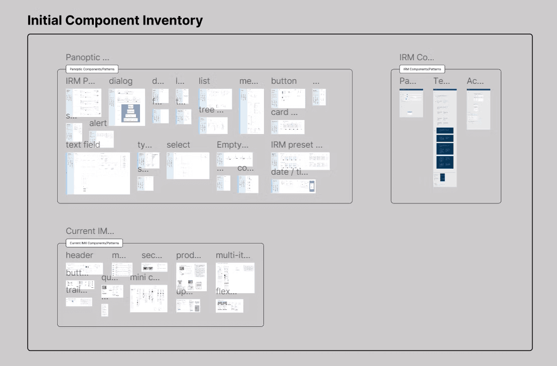
While the Express team didn’t have an established design system, I had access to the main Iron Mountain design system and the “Panoptic Design System,” where the latter is used for a specific Iron Mountain platform. After surveying these two systems and the Express team’s Figma files, I compiled a large inventory of styling and components. Not only would drawing from these systems streamline the design system creation, but it would also ensure certain styling elements are consistent with the Iron Mountain brand.
... but how do I know what's good?
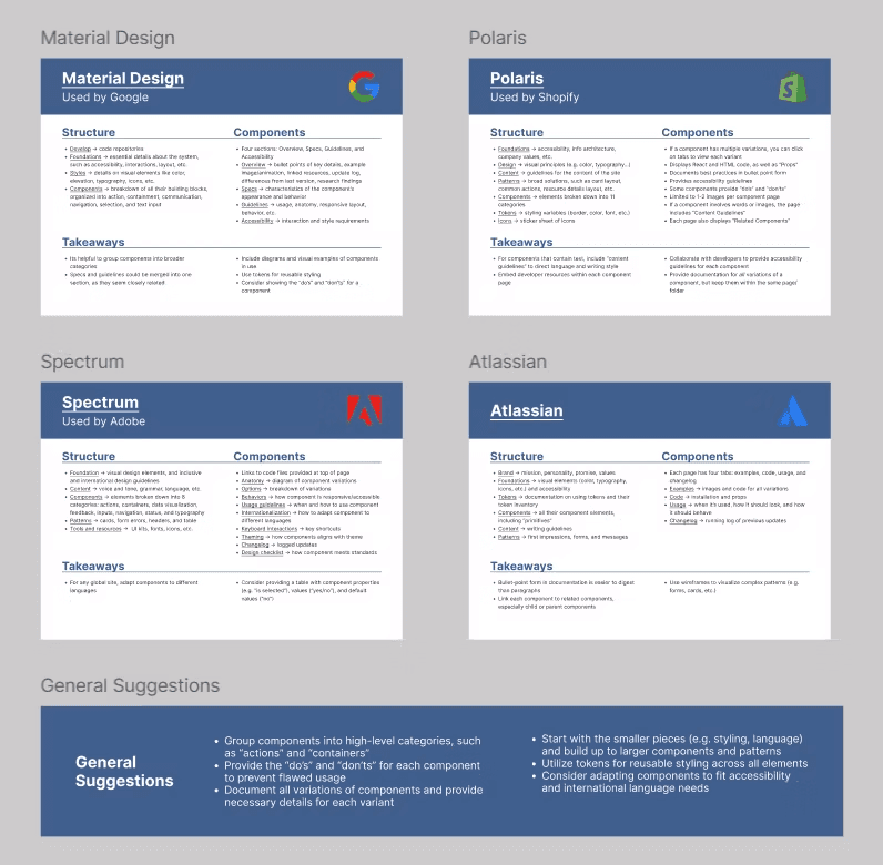
Another part of this research phase was conducting a competitive analysis of four design systems from esteemed companies: Google, Shopify, Adobe, and Atlassian. This phase was especially helpful for understanding the structures of good design systems, as these four companies are highly rated and successful.
Styling
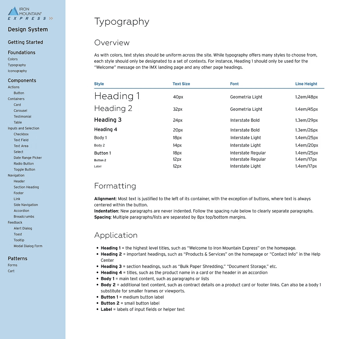
The styling portion of the system includes colors, typography (right), and iconography.
I synthesized the current styling of the Express website, the other Iron Mountain styling, and common styling standards (e.g. accessible text sizing) to create and document the styling.
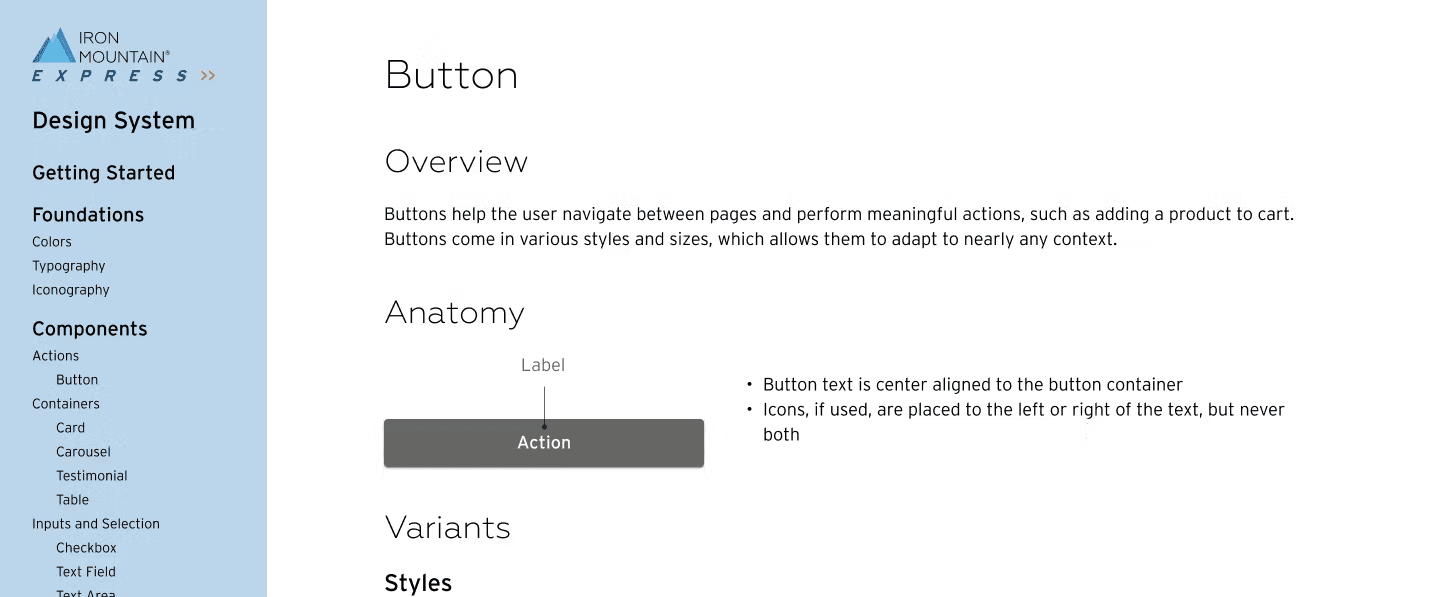
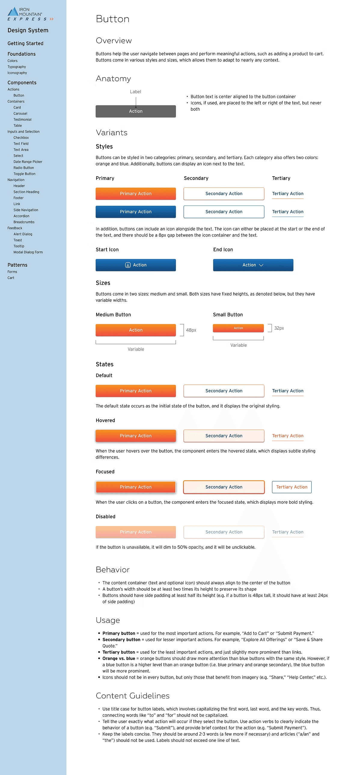
Component
Over the course of the internship, I developed 24 distinct components. Each component has its own page, as seen to the right, containing several sections:
Overview - Short summary of the purpose of the component
Anatomy - Labeled diagram of the component
Variants - Different styles or states of the component
Behavior - How the component should respond to sizing/spacing adjustments
Usage - When and how the component should be implemented
Content Guidelines - How to write or display effective content
User Testing
In the last few weeks of this project, I prepared, launched, and analyzed an unmoderated usability test via UserZoom. The test involved three short tasks and a questionnaire at the start and end of the study.
Goals
Test the functionality and aesthetics of existing input and selection components
Identify pain points with the quantity threshold and contact form process
Assess users’ ability to navigate and interact with the existing product cards
Findings
100% success rate on all tasks, BUT...
The toggle button's lack of labeling and subtle styling led to difficulties for the users
Users display mixed feelings about having to contact an agent if purchasing a quantity above a threshold, with 44% expressing a negative sentiment and 69% a neutral/positive sentiment
Many users would benefit from an additional navigation tool to explore the “All Offerings” page
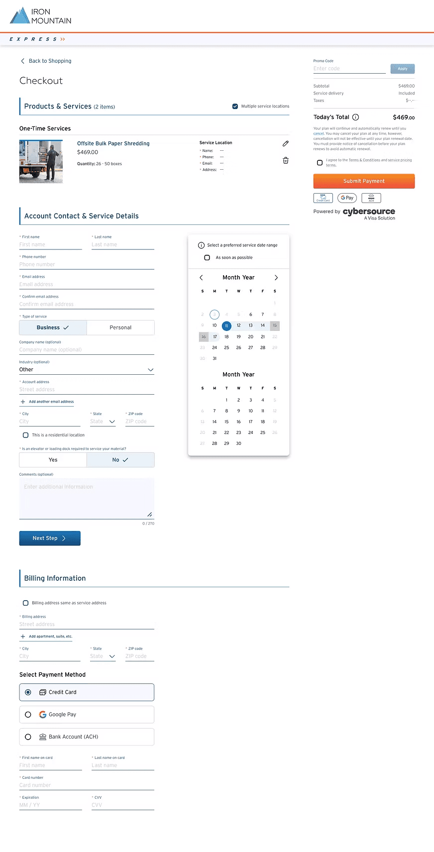
Applying the System
Before
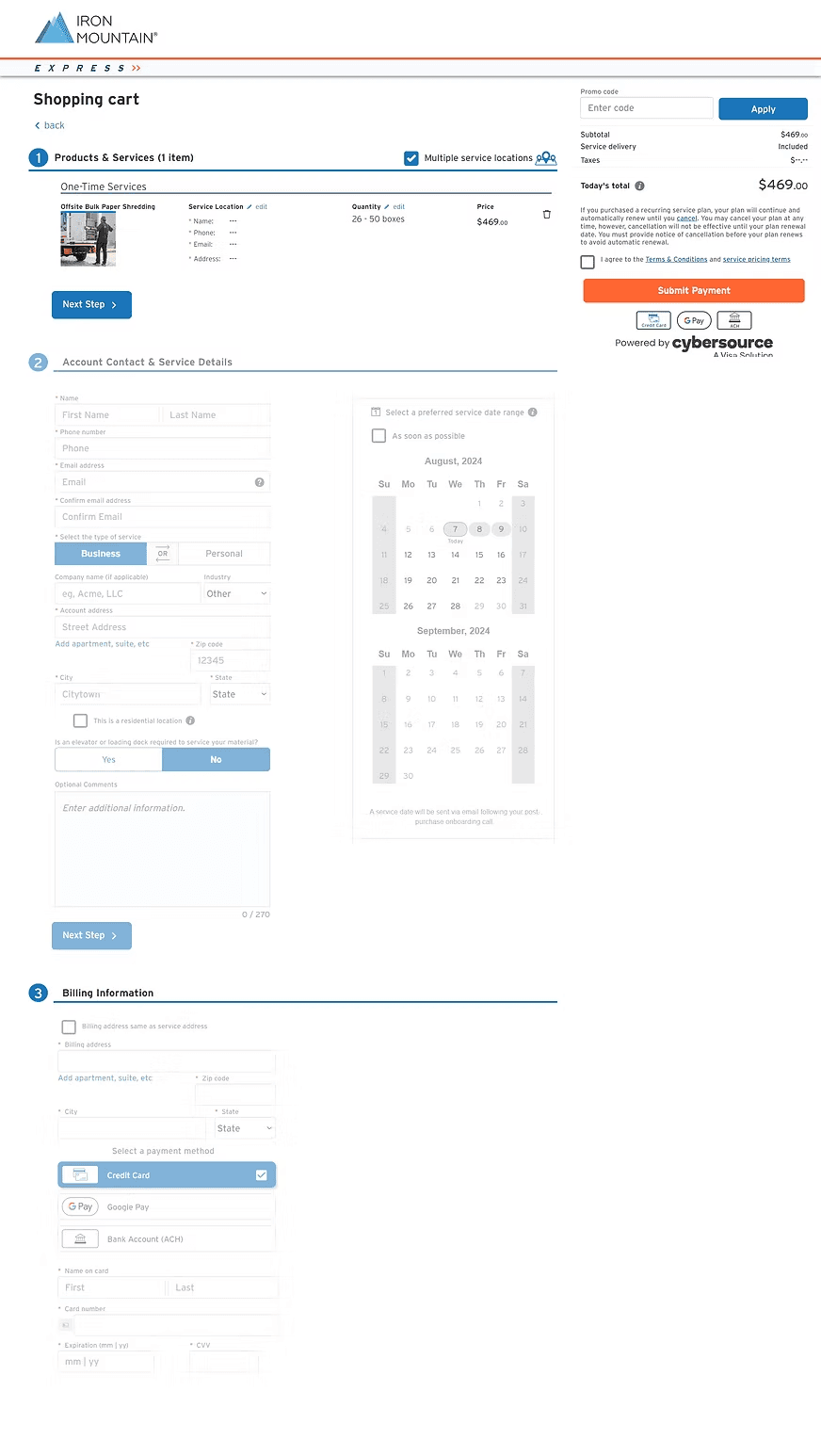
After
Benefits
Consistency
An established system of design elements ensures visual and functional harmony throughout the site.
Efficiency
Wireframing becomes highly streamlined with the ability to drag and drop elements into designs.
Flexibility
All elements and components are highly customizable for various contexts and open to future enhancements.
Next Steps
While the design system may appear comprehensive, it is continually evolving. All elements should be reviewed, tested, and updated regularly to ensure the design system serves its purpose well. Additional sections could be included as well, such as...Test navigation structure & reorganize based on user feedback
Patterns
Meaningful combinations of components that help users achieve their goals
Brand & Content Guidelines
How the company wants to represent itself through its words, visuals, and overall experience
Media Guidelines
How to select relevant, useful images and embed them appropriately into the site
Accessibility Guidelines
How to ensure the site is usable for as many customers as possible
Reflection
Having the opportunity to build this design system throughout my internship was truly the greatest experience. It was a learning curve, as I had no previous knowledge or expertise with design systems at all, but that just made this project even more fruitful. Through all my research, designing, and user testing, I gained not only a project I can call my own, but a new set of professional and personal skills that I will carry with me into my future.